2026 - Founding Product Designer - Aria Intelligent Solutions
Agentic AI - Creating the HarmonIQ Platform.
Background.
I joined Aria Intelligent Solutions as their Founding Designer for their first AI agentic SaaS product: HarmonIQ. Built the brand + UI from zero - logo, identity, brand guidelines, website, launch motion video, platform layout - leading to a successful launch across industries.
HarmonIQ Launch Video: 10K+ impressions day one – LinkedIn and X, driven to a branded landing site. (below)

Outcome: completed internal beta:
Only used for internal use and a few established clients. (below)
Problem.
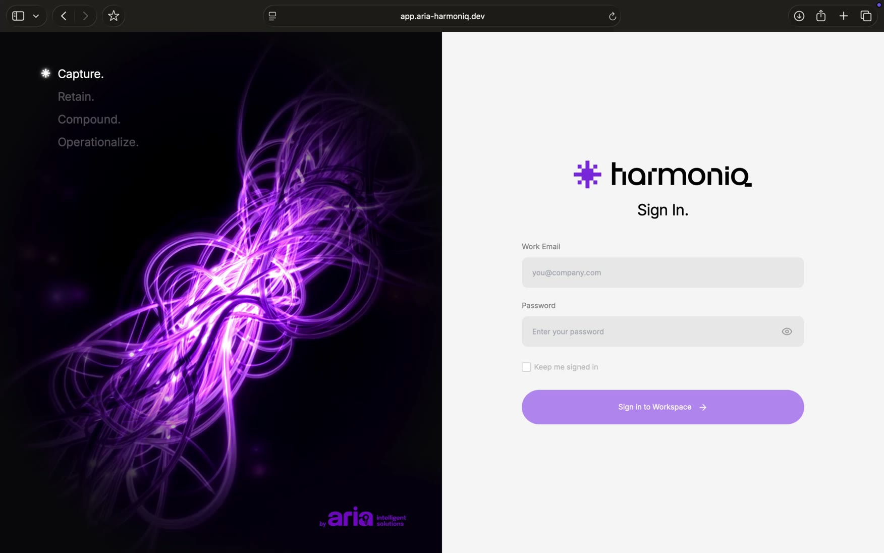
HarmonIQ had no identity, it did not exist. No logo, visual language, interface, information architecture, no way to present itself like a serious product to enterprise buyers across Retail, CPG, and Pharma. Before a single client could trust its purpose, it needed to look like something worth trusting.
To tackle this problem I wanted to keep in mind three threads that would shape the design direction for the system + interface:
Solution:
HarmonIQ needed to look distinct, work across multiple verticals, and earn trust, not hype.
Brand Design.
From Idea to Mark.
I started with the logo's iconography and type – adapting classics like Avenir and Helvetica into a rounded custom typeface, then hand-editing individual letterforms to give it a more digital feel.
Its modular nature scales cleanly across verticals, deliberately avoiding the typical soft AI-icon look (Claude/ChatGPT). Instead, nodding to the early digital age – pixels, binary, that nostalgia era – lending a sense of trustworthiness.
Brand Design.
A mark designed for motion.
To bring the mark to life - I wanted to incorporate motion into its fundamental design language.
Brand Design.
From Mark to System.
The pixel nature of the logo became the foundation for a diverse system application, bringing in the signature purple brand color against primarily dark backgrounds.
Brand Design.
System Application.
The HarmonIQ system across real world verticals.
Interface Design.
Prototyping with Claude.
After establishing the brand look and feel, it was time to craft the UI. Having mapped out the information architecture with the director of AI solution delivery, I dove straight into building a Claude prototype to present to the team and start interacting for the beta launch.
Figma was used to refine screens, and build a design system that could be fed straight to Claude Code/Design.
Below you can see the transition from the initial prototypes to the launched beta.
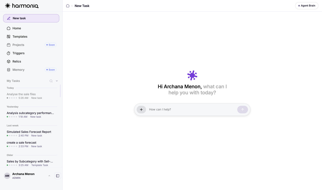
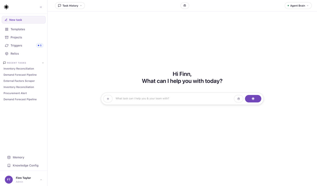 Vibe-codedBeta v1
Final launch.
Internal beta below.
Web design.
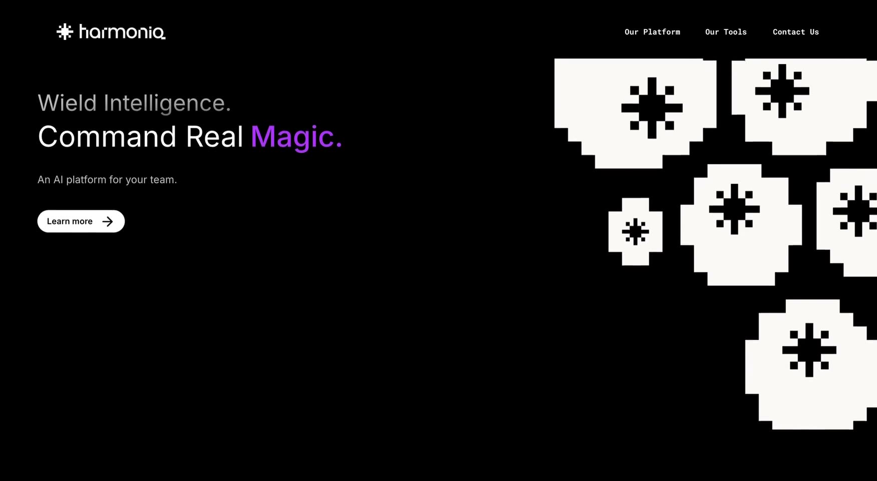
HarmonIQ initial website concepts for investor outreach.
Site Launched.
The final version chosen for launch.
Outcome.
From 0 to launch, in numbers. 16 weeks, product ideation start to public launch – 4 weeks ahead of an internal release. Launch Conversion: 2 new enterprise clients signed post-launch – plus existing clients opting into trials after seeing it in action.
- 16 wks0→1 Timeline.From first sketch to launch-ready system.
- 100+Design Assets.Logo lockups, icons, and UI components delivered.
- 10k+Brand Impressions.After day-one launch across the web.